
Medical Salt Packaging
The minimal design language helps communicate cleanliness, reliability, and ease of use, making the product approachable for everyday consumers while maintaining the credibility expected from medical products.
Packaging
Medical salt
Know More
Clean, Minimal & Trustworthy Medical Packaging
Overview
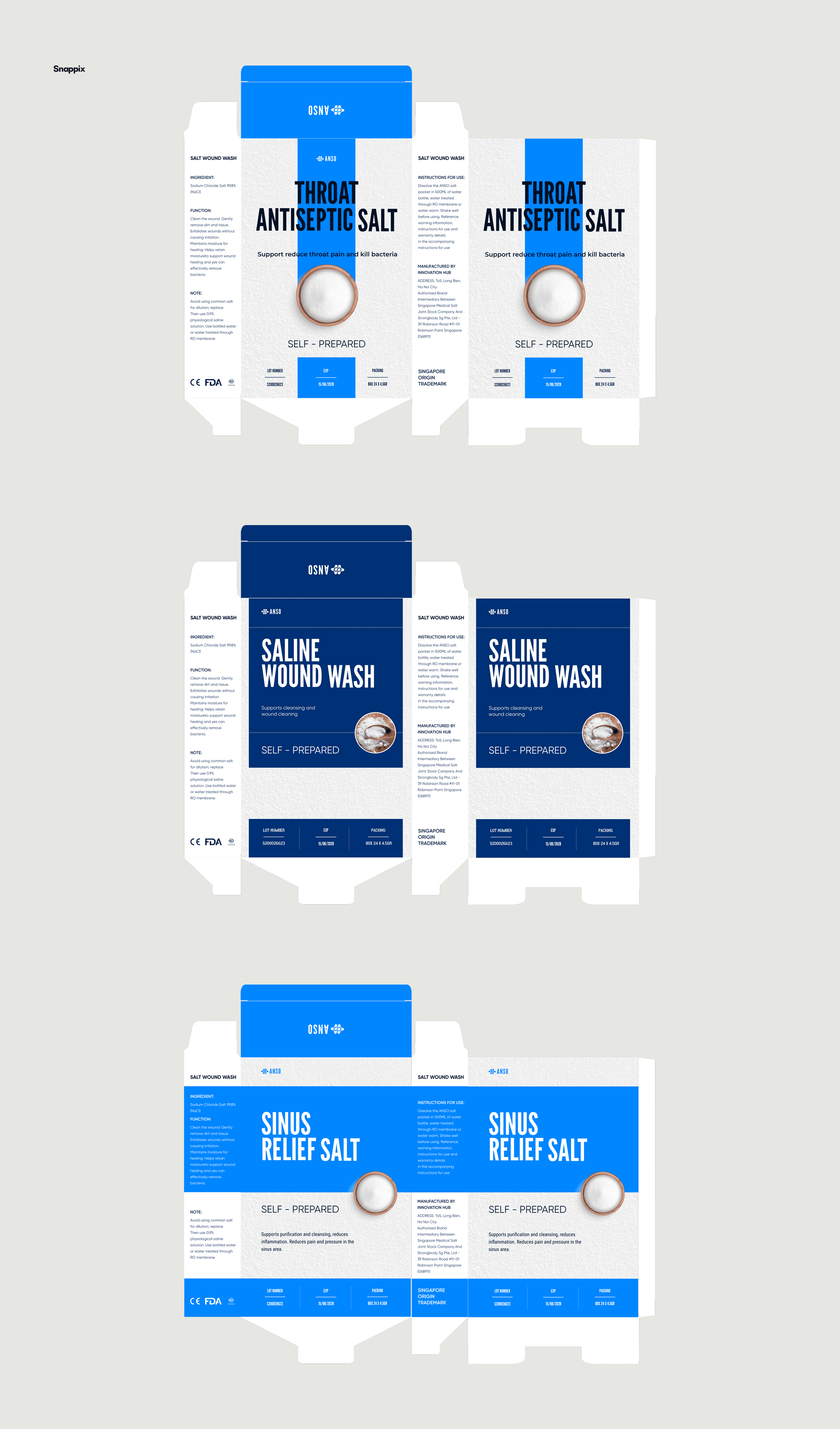
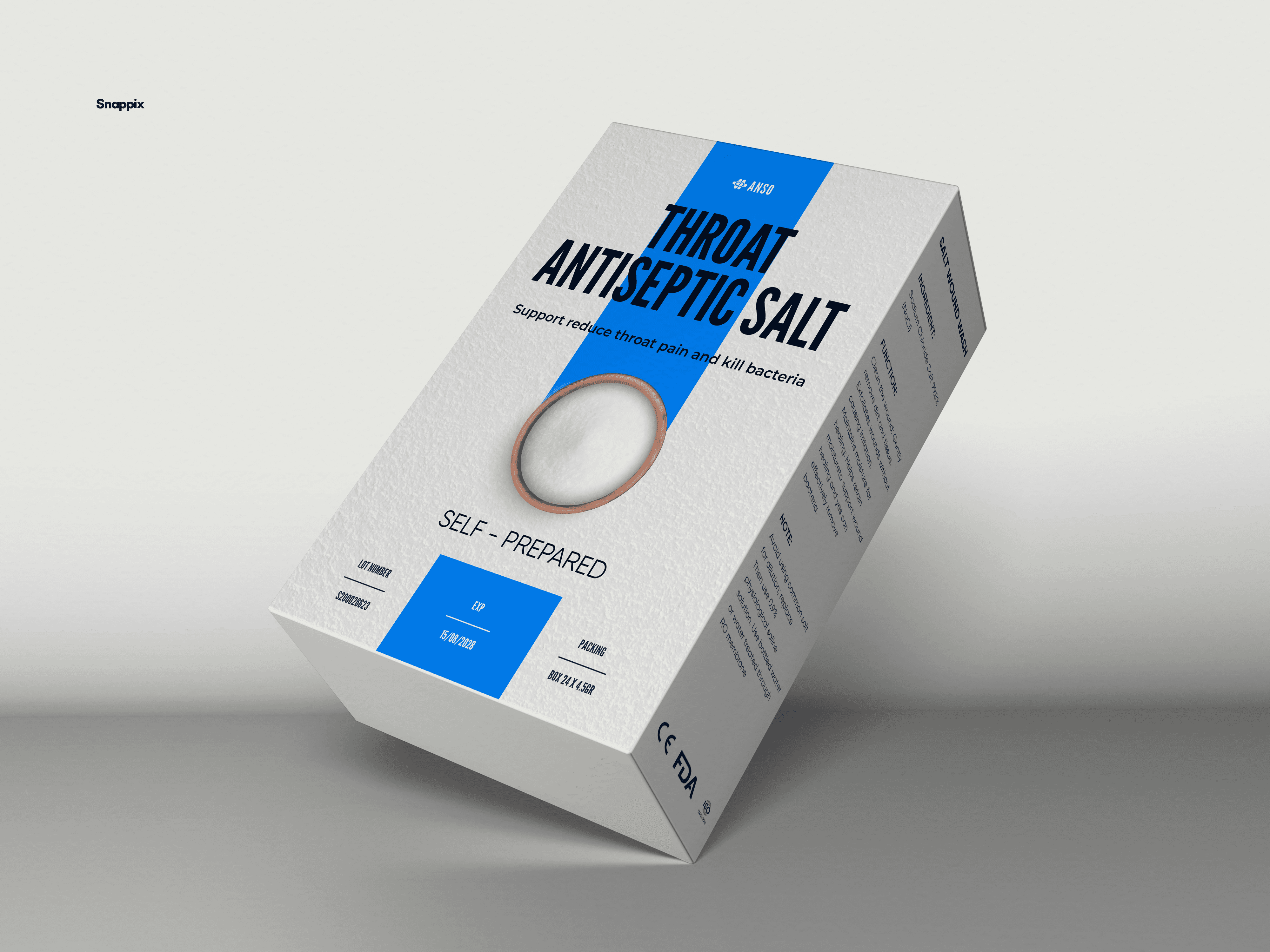
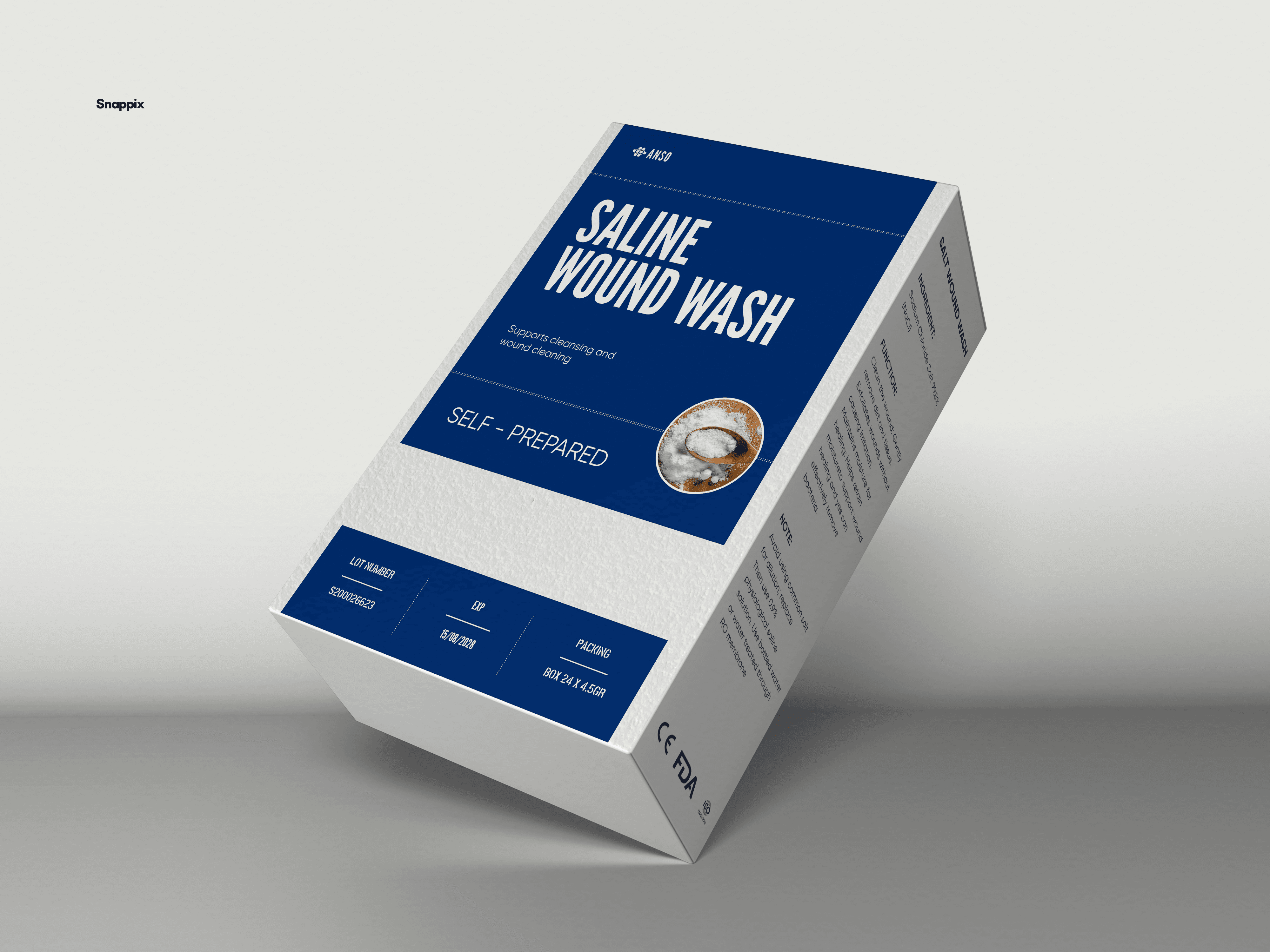
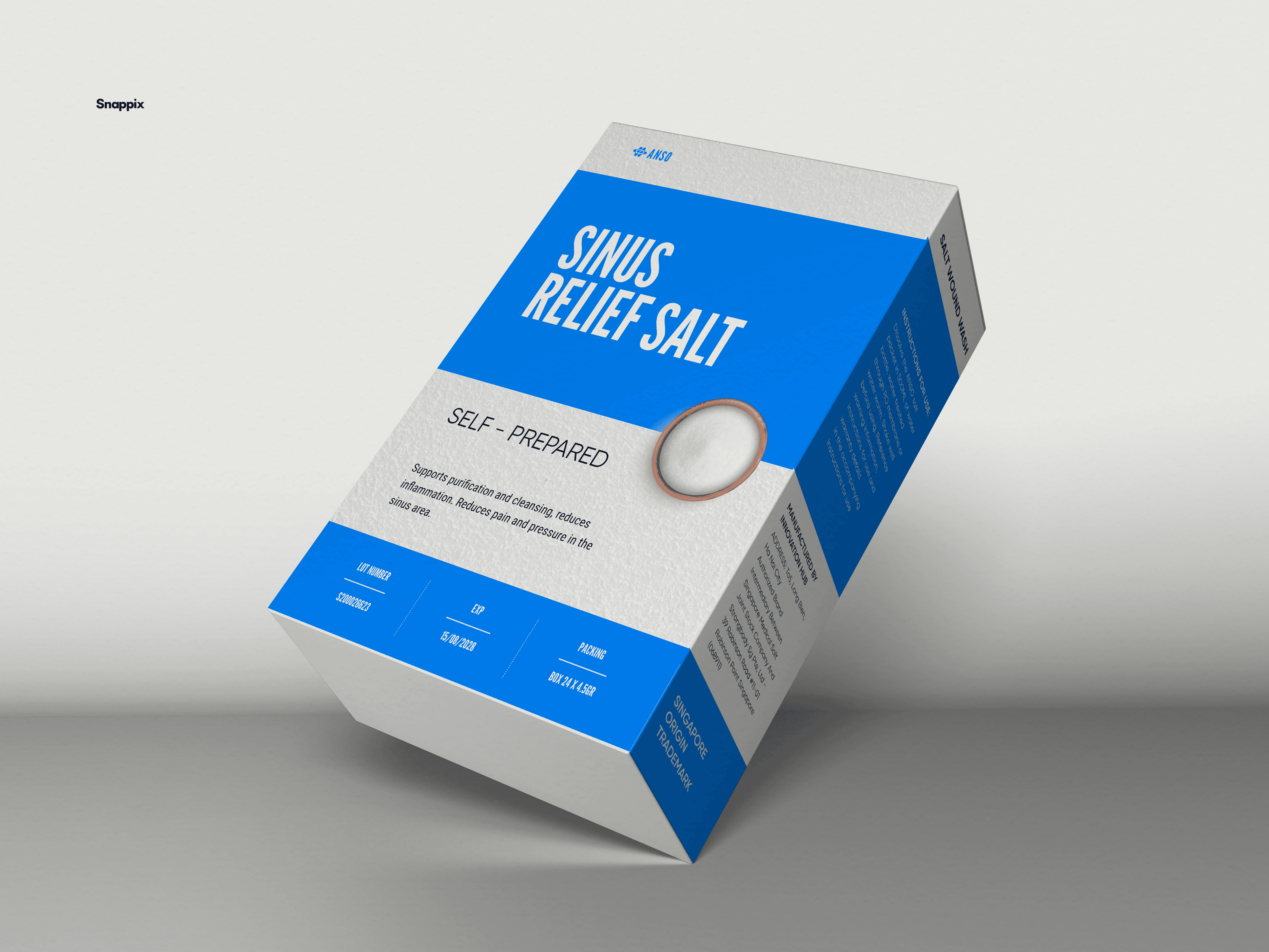
This project presents a packaging design system for ANSO medical salt products, including three variations: Sinus Relief Salt, Saline Wound Wash, and Throat Antiseptic Salt. The design focuses on creating a clean and professional visual identity that communicates purity, safety, and medical reliability, while maintaining a modern and minimal aesthetic.
The goal of this project was to develop a packaging solution that clearly differentiates the product categories while maintaining a consistent brand language across the entire product line.
Concept & Design Direction
The visual concept is built around the idea of clinical clarity and functional simplicity. Medical products often require strong visual trust, so the design avoids unnecessary decoration and instead emphasizes clean typography, structured layout, and clear information hierarchy.
A dominant blue color palette is used to symbolize hygiene, safety, and medical professionalism. The blue panels help highlight the product names, allowing users to quickly identify the function of each product.
Minimalistic product imagery — such as the salt texture in a ceramic bowl — adds a subtle visual cue that reinforces the product’s natural ingredient without overwhelming the design.
Visual System
The packaging follows a grid-based layout system to ensure clarity and balance. Key elements include:
Bold condensed typography for strong product visibility
Structured information blocks to improve readability
Medical certification icons placed clearly for credibility
Consistent brand placement for better recognition
Color blocking to visually organize the content
Each product variation maintains the same structure but introduces slight differences in composition and color emphasis to distinguish its specific function.
More Works
snappixdesign


FAQ
01
What design services do you offer?
02
Who is this service best suited for?
03
What is your design process like?
04
How long does a typical project take?
05
Will the design be fully customizable and scalable?
06
How do we get started?
Medical Salt Packaging
The minimal design language helps communicate cleanliness, reliability, and ease of use, making the product approachable for everyday consumers while maintaining the credibility expected from medical products.
Packaging
Medical salt
Know More
Clean, Minimal & Trustworthy Medical Packaging
Overview
This project presents a packaging design system for ANSO medical salt products, including three variations: Sinus Relief Salt, Saline Wound Wash, and Throat Antiseptic Salt. The design focuses on creating a clean and professional visual identity that communicates purity, safety, and medical reliability, while maintaining a modern and minimal aesthetic.
The goal of this project was to develop a packaging solution that clearly differentiates the product categories while maintaining a consistent brand language across the entire product line.
Concept & Design Direction
The visual concept is built around the idea of clinical clarity and functional simplicity. Medical products often require strong visual trust, so the design avoids unnecessary decoration and instead emphasizes clean typography, structured layout, and clear information hierarchy.
A dominant blue color palette is used to symbolize hygiene, safety, and medical professionalism. The blue panels help highlight the product names, allowing users to quickly identify the function of each product.
Minimalistic product imagery — such as the salt texture in a ceramic bowl — adds a subtle visual cue that reinforces the product’s natural ingredient without overwhelming the design.
Visual System
The packaging follows a grid-based layout system to ensure clarity and balance. Key elements include:
Bold condensed typography for strong product visibility
Structured information blocks to improve readability
Medical certification icons placed clearly for credibility
Consistent brand placement for better recognition
Color blocking to visually organize the content
Each product variation maintains the same structure but introduces slight differences in composition and color emphasis to distinguish its specific function.
More Works
snappixdesign
FAQ
What design services do you offer?
Who is this service best suited for?
What is your design process like?
How long does a typical project take?
Will the design be fully customizable and scalable?
How do we get started?