
SB Product Catalogue
This is a modern, data-clear, and globally adaptable catalogue design tailored for healthcare distribution and international partners.
Catalogue
Catalog
Know More
StrongBody Product Catalogue – Modern Healthcare Brand System
Overview
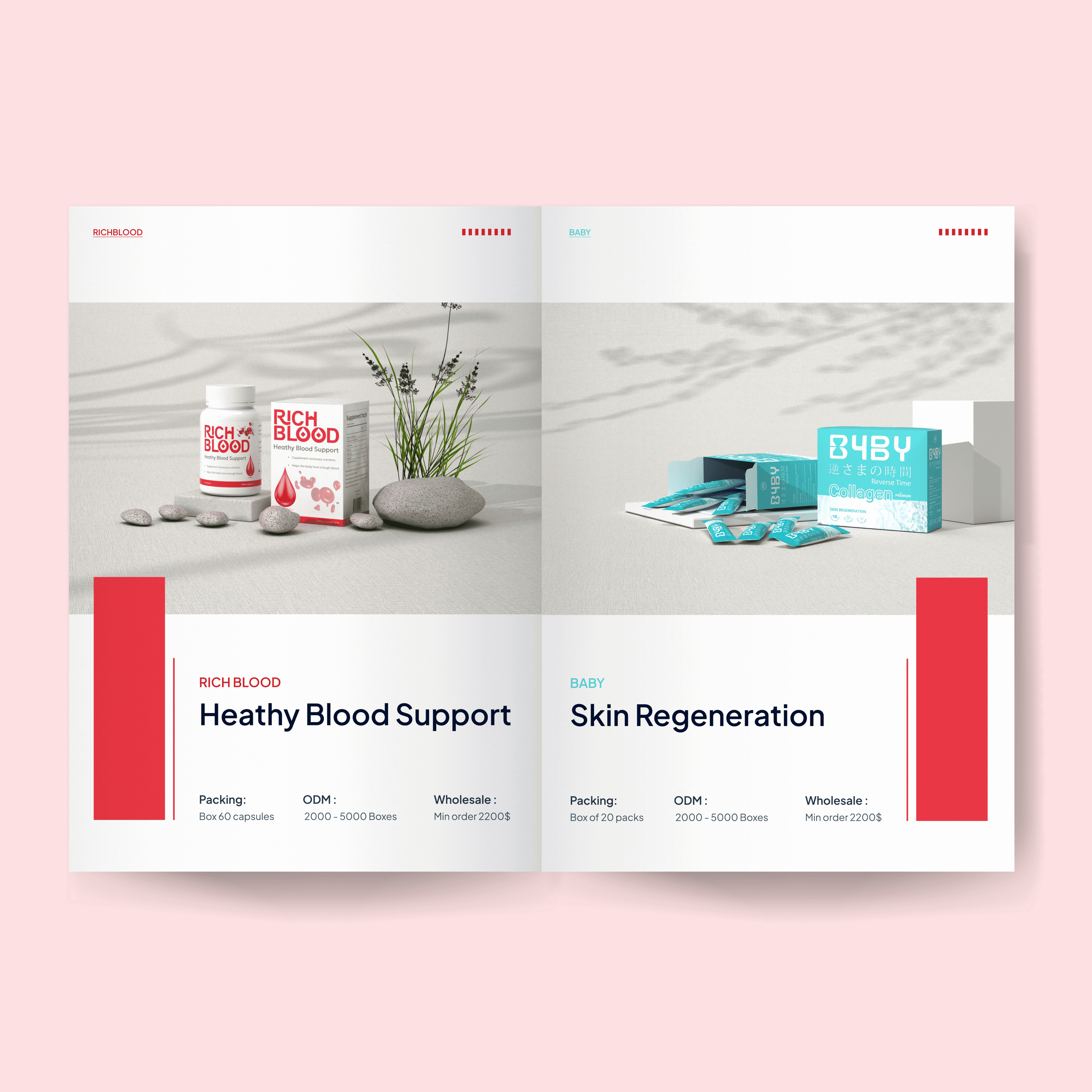
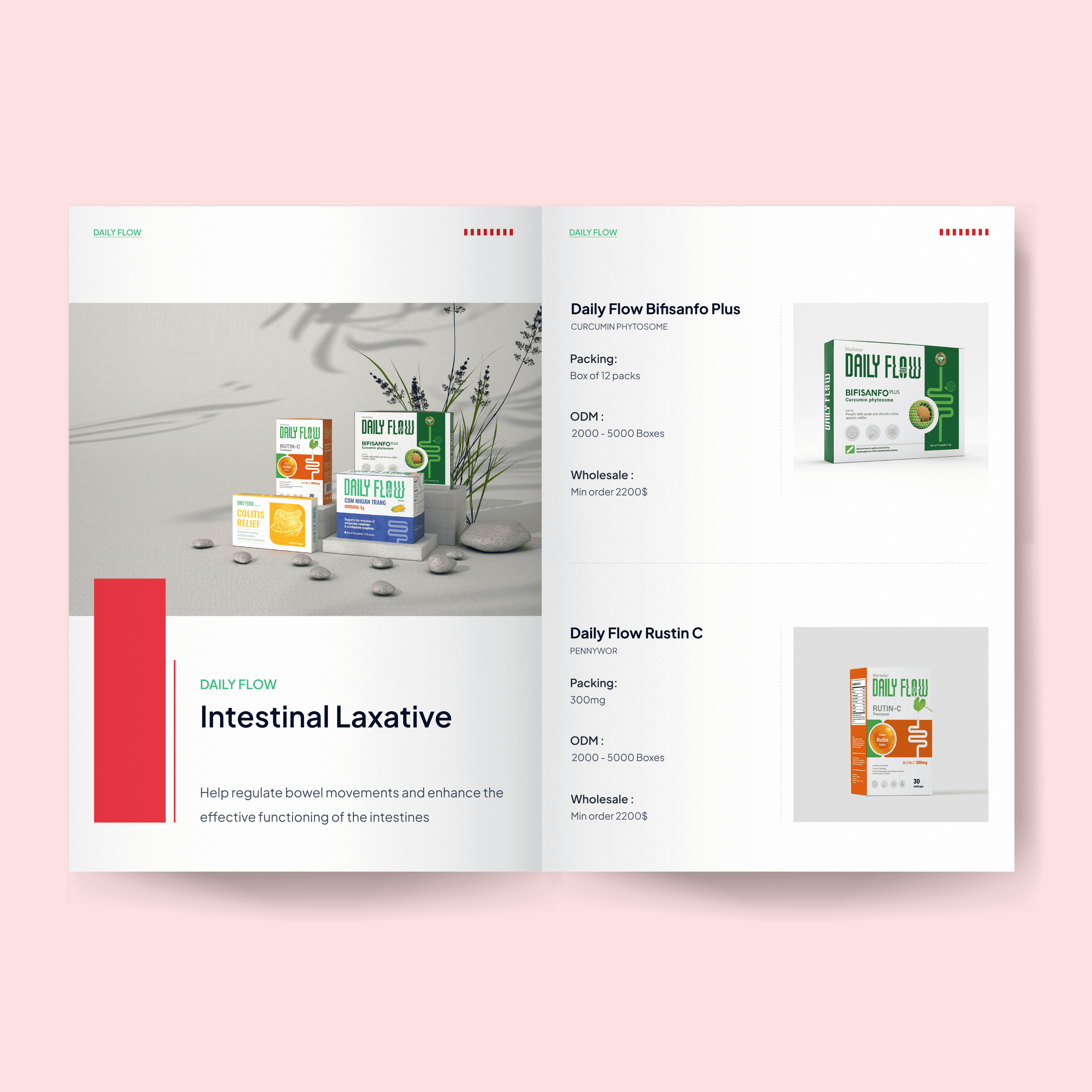
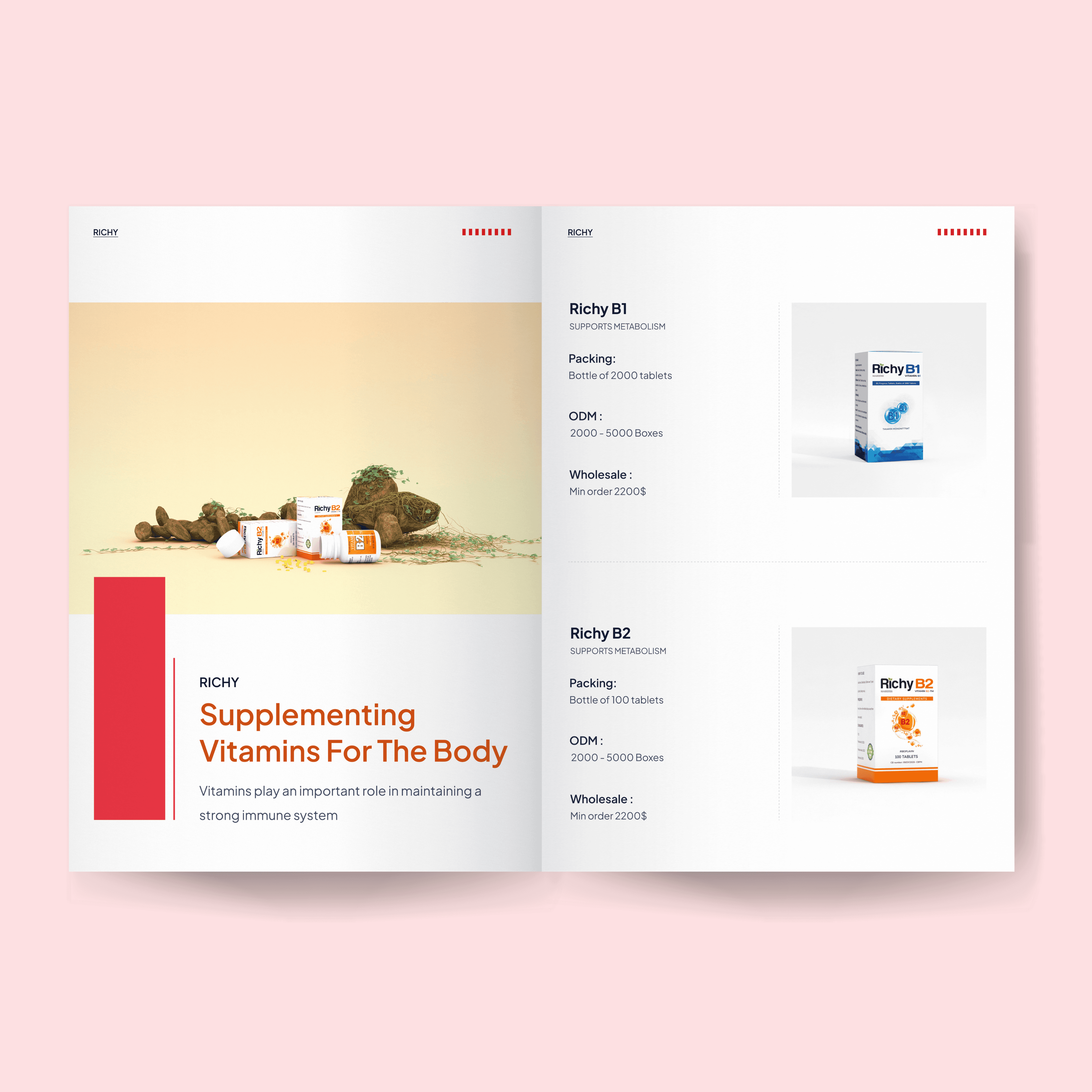
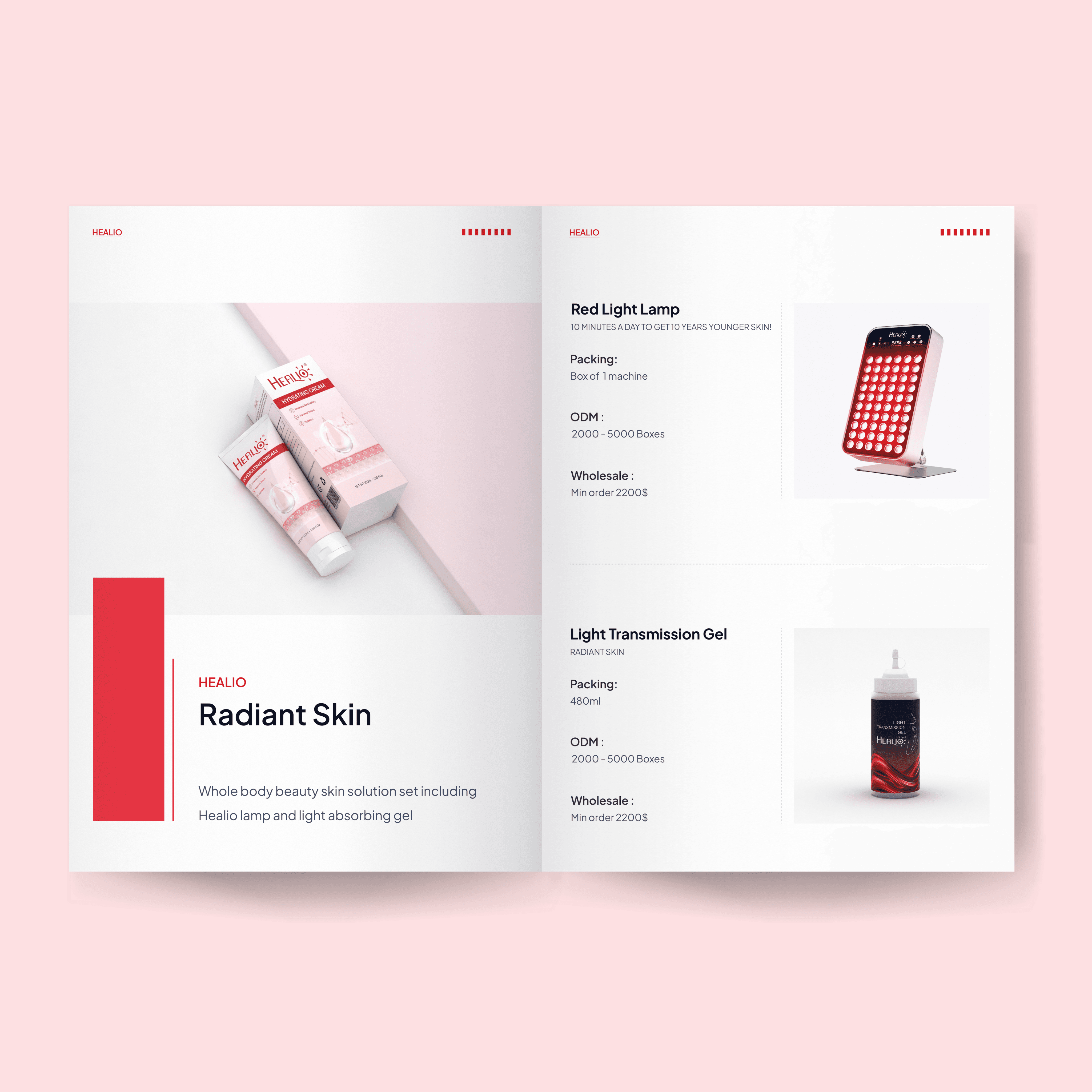
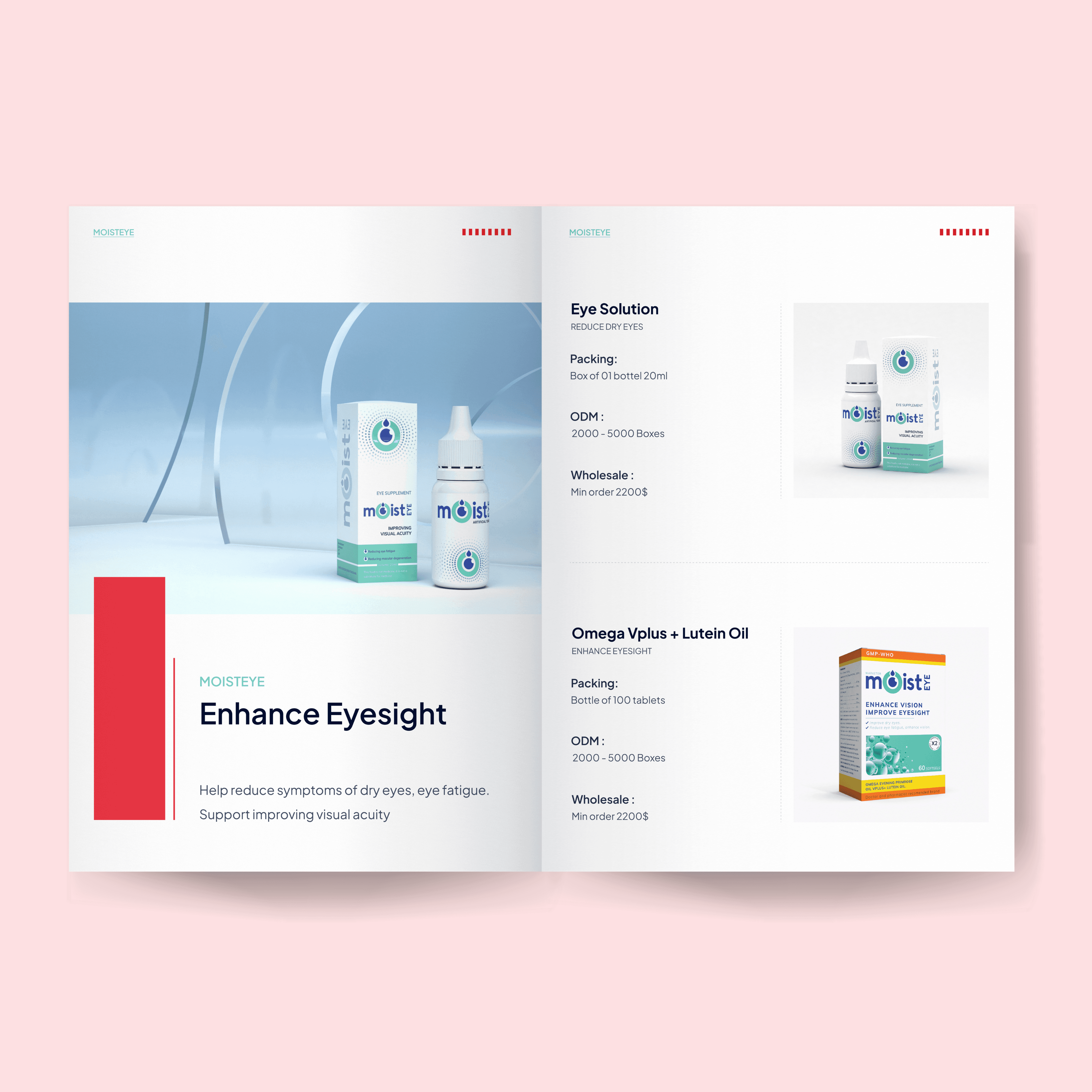
This catalogue was designed as a comprehensive product presentation for StrongBody, a multinational proactive healthcare ecosystem. The goal was to create a clean, structured, and brand-consistent system that showcases multiple product lines while maintaining clarity and visual hierarchy.
The design balances corporate credibility with modern aesthetics, helping StrongBody communicate professionalism, scale, and innovation.
Design Concept
The visual direction follows a minimal, grid-based layout with strong typographic hierarchy and strategic use of brand colors (red accents combined with neutral tones).
Each spread is carefully structured to:
Highlight product visuals clearly
Present specifications in an easy-to-scan format
Maintain consistent alignment across multiple categories
The red accent blocks act as visual anchors, guiding the reader’s attention while reinforcing brand identity throughout the catalogue.
Visual System
Clean white background to enhance product visibility
Consistent product framing for a unified brand ecosystem feel
Balanced whitespace for readability and premium perception
Section-based organization (Intimate Care, Respiratory, Nutrition, Digestive Health, etc.)
This system ensures scalability, allowing new product lines to be added without breaking visual consistency.
More Works
snappixdesign


FAQ
01
What design services do you offer?
02
Who is this service best suited for?
03
What is your design process like?
04
How long does a typical project take?
05
Will the design be fully customizable and scalable?
06
How do we get started?
SB Product Catalogue
This is a modern, data-clear, and globally adaptable catalogue design tailored for healthcare distribution and international partners.
Catalogue
Catalog
Know More
StrongBody Product Catalogue – Modern Healthcare Brand System
Overview
This catalogue was designed as a comprehensive product presentation for StrongBody, a multinational proactive healthcare ecosystem. The goal was to create a clean, structured, and brand-consistent system that showcases multiple product lines while maintaining clarity and visual hierarchy.
The design balances corporate credibility with modern aesthetics, helping StrongBody communicate professionalism, scale, and innovation.
Design Concept
The visual direction follows a minimal, grid-based layout with strong typographic hierarchy and strategic use of brand colors (red accents combined with neutral tones).
Each spread is carefully structured to:
Highlight product visuals clearly
Present specifications in an easy-to-scan format
Maintain consistent alignment across multiple categories
The red accent blocks act as visual anchors, guiding the reader’s attention while reinforcing brand identity throughout the catalogue.
Visual System
Clean white background to enhance product visibility
Consistent product framing for a unified brand ecosystem feel
Balanced whitespace for readability and premium perception
Section-based organization (Intimate Care, Respiratory, Nutrition, Digestive Health, etc.)
This system ensures scalability, allowing new product lines to be added without breaking visual consistency.
More Works
snappixdesign
FAQ
What design services do you offer?
Who is this service best suited for?
What is your design process like?
How long does a typical project take?
Will the design be fully customizable and scalable?
How do we get started?